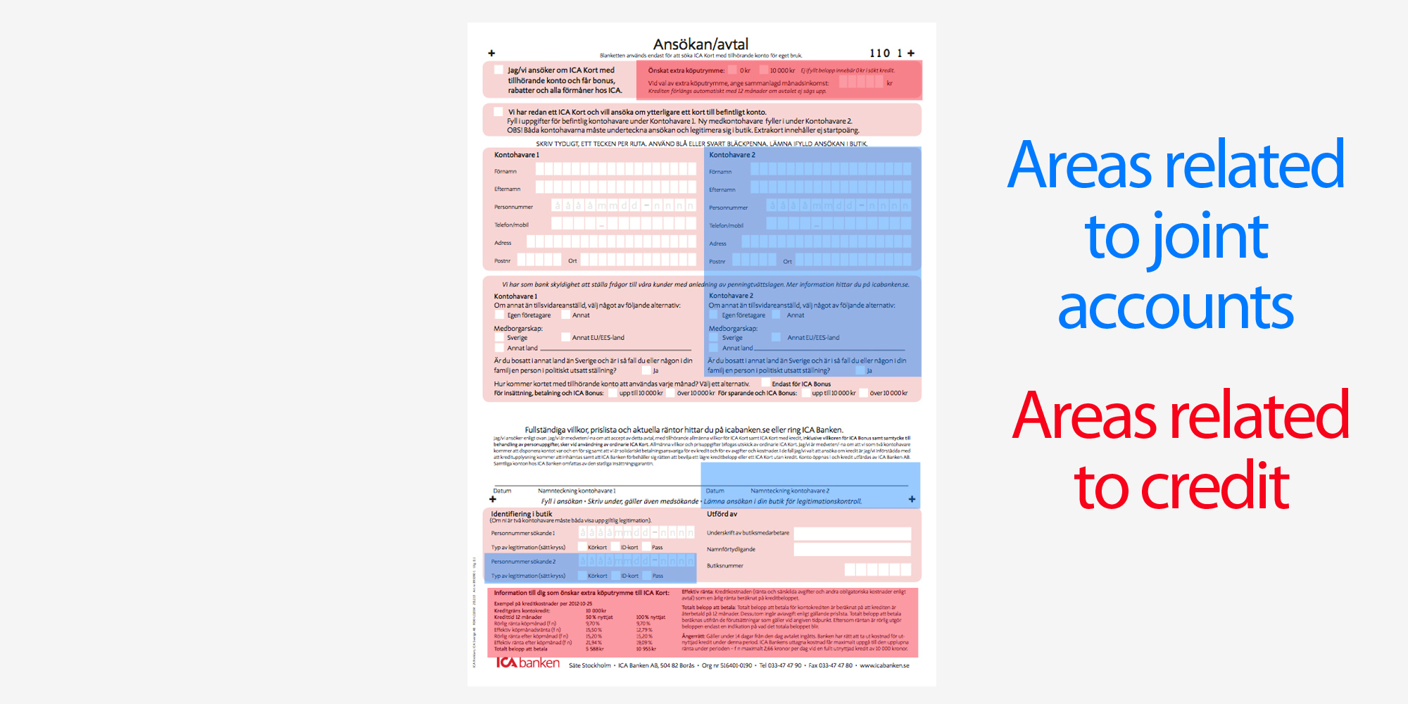
Signing up for an ICA Card is a perfect example of a solution designed to fit everyone and in the end creates a bad experience for everyone. The basic functionality of an ICA card allows the user to gain points on every purchase as well as allowing users to pay with it. Additionally users can add the option of having credit on the card as well as create a joint account.
The result is a very complicated form containing a lot of unnecessary features while not having any room to explain the benefits of the card itself.
Singing up for an ICA card was easier, allowing users to sign up on impulse.
The form itself explained the benefits of having an ICA card to compel users to sign up.
After taking a quick look at the competitors it becomes clear that they've all moved on to online signup solutions. I also found that none of them offer joint accounts which is an interesting selling point for ICA.
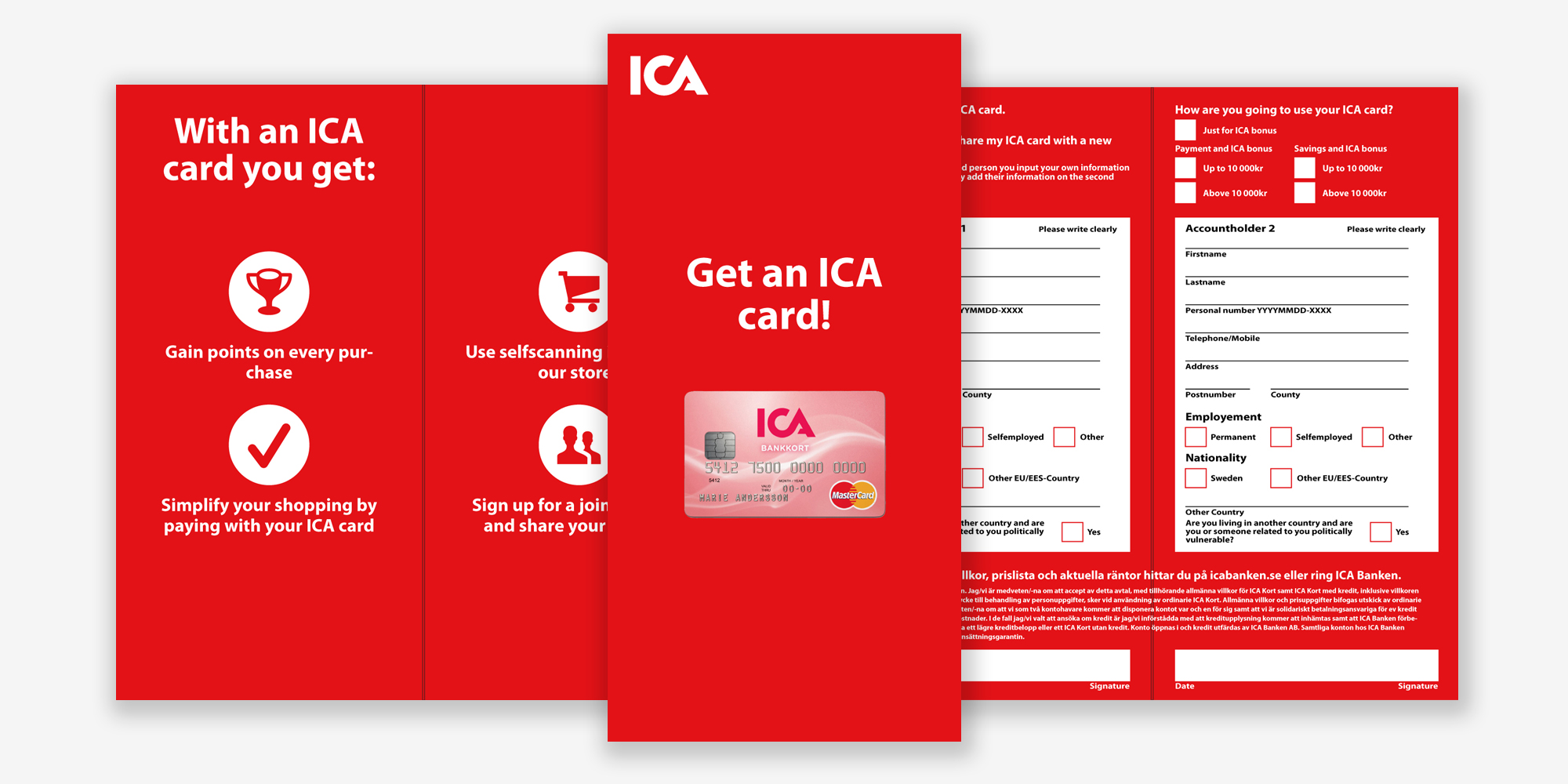
While designing my solution I decided to make it paper-based as I believe that there's something about having a physical form that you can bring home - everything doesn't have to be digital.
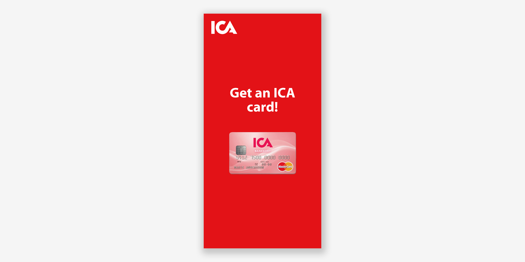
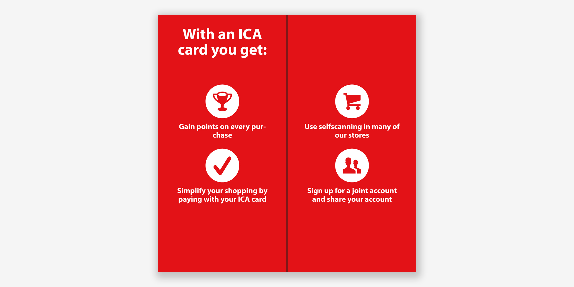
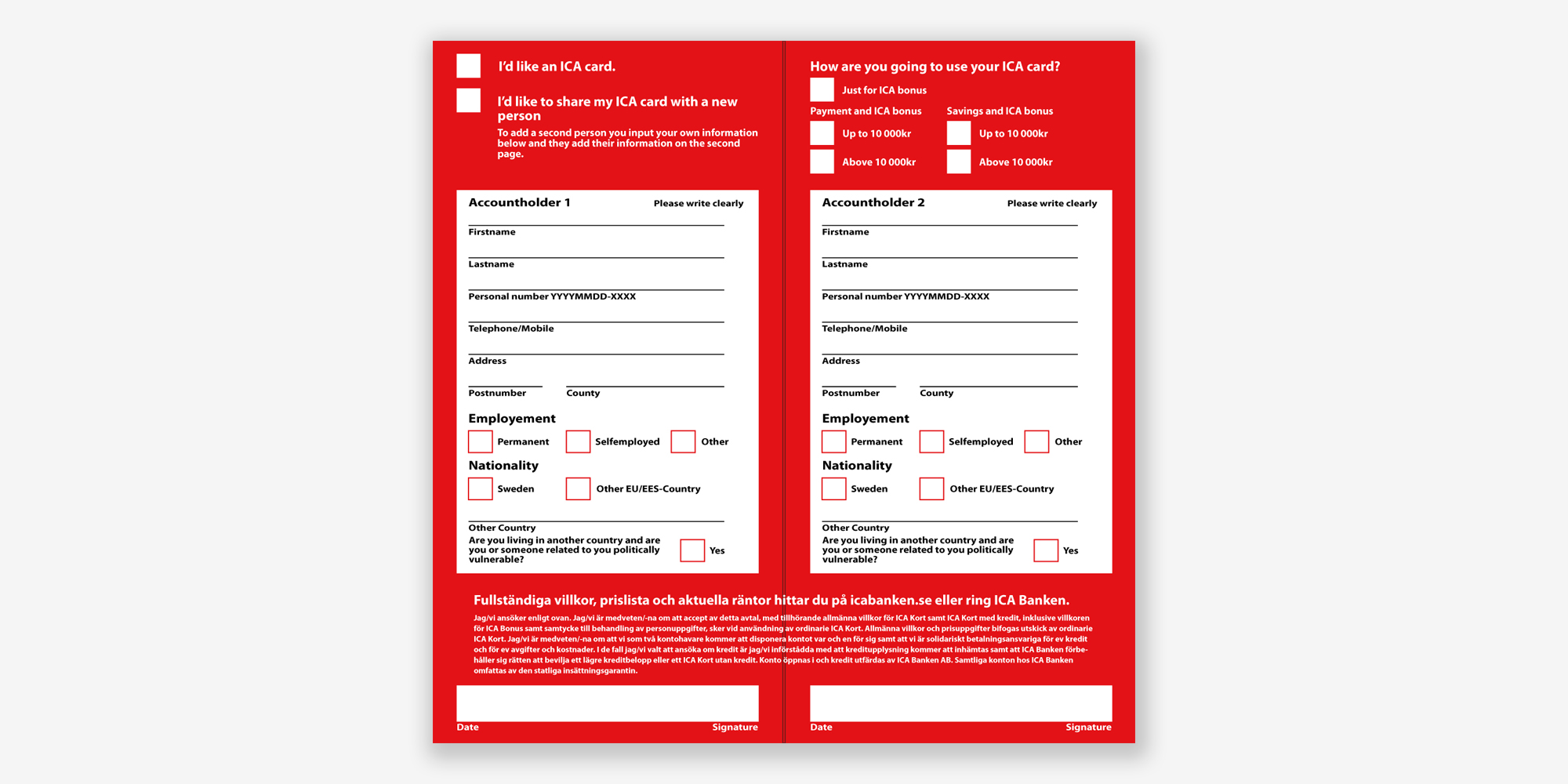
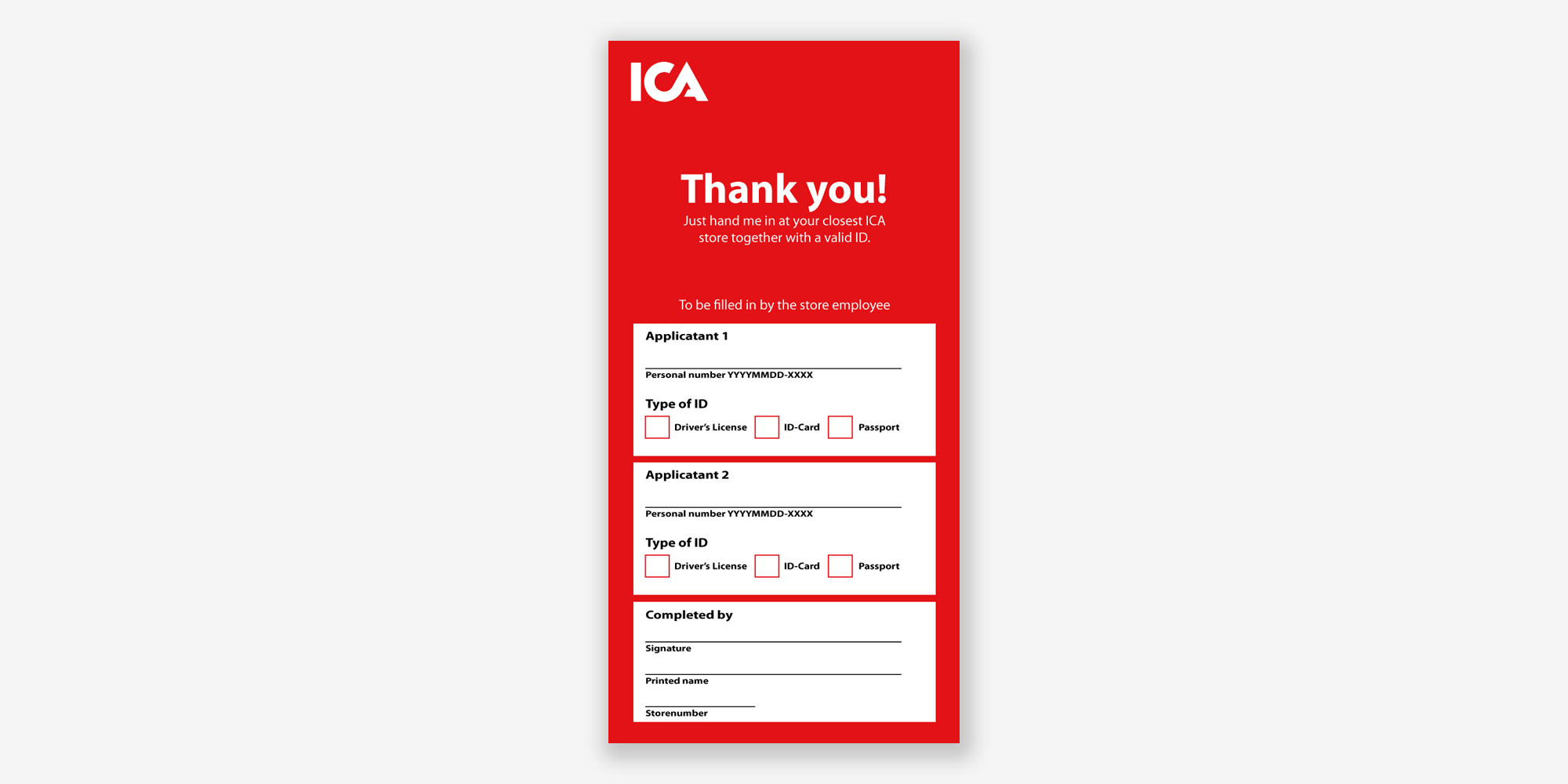
The solution is a pamphlet that explains why they should get an ICA card and helps them signing up for one. It starts out by explaining the benefits of having an ICA card and how a joint account makes life easier for families. The result is a simple sign up pamphlet where users add their personal information and where creating a joint account is as easy as adding a plus one.
I wanted to keep as much the functionality as possible however I decided to remove the option for credit. Not only does it take up a significant amount of space but it also increases cognitive overhead which takes away from the simplicity of the sign up process. The key goal of this concept is to increase the amount of users who signup for an ICA card, extras such as credit will instead be handled separately afterwards.
